How Do You Make Beige Color
So, you're looking to whip up some beige, huh? Maybe you're touching up some interior trim, trying to match a vintage dashboard, or just exploring the world of automotive aesthetics. Whatever the reason, creating the perfect beige isn't as simple as just slapping some colors together. It's about understanding color theory, pigment interactions, and achieving the right balance. Think of it like tuning an engine – you need to understand the components to get the desired performance. This article will break down the process, providing a practical guide for achieving the perfect beige, whatever your automotive application.
Purpose: Matching and Customizing Automotive Beige
Why bother learning how to mix beige paint? Several reasons spring to mind, especially in the automotive world:
- Repair Work: Scratches, chips, or damage to interior panels often require color matching. Pre-mixed beige might not be a perfect match, especially in older vehicles where fading has occurred. Knowing how to mix ensures a seamless repair.
- Customization: Maybe you want to repaint your entire interior or customize accent pieces. Understanding beige mixing gives you the freedom to create a unique and personalized look.
- Restoration: Restoring a classic car often involves replicating original colors. Beige was a common color in many vintage interiors, and accurate replication is crucial for authenticity.
- Cost Savings: Mixing your own paint can be more cost-effective than buying multiple pre-mixed shades, especially if you only need a small amount.
- Learning: Understanding color theory is a valuable skill for any DIY enthusiast. It allows you to experiment, troubleshoot, and achieve predictable results in all your painting projects.
Key Specs and Main Parts (Pigments)
The core components of any beige paint are the base colors you'll be mixing. Here's a breakdown:
- White: The foundation. This is your primary diluent and provides the overall lightness. Titanium White or Zinc White are common choices. Titanium White offers superior opacity.
- Brown: Provides the earthiness and warmth. Raw Umber, Burnt Umber, or even a touch of Raw Sienna can be used. The specific brown you choose will influence the final beige shade. Raw Umber tends towards a cooler, grayer brown, while Burnt Umber has a warmer, reddish tone.
- Yellow: Adds brightness and warmth. Yellow Ochre is a good starting point, offering a subtle, muted yellow. Cadmium Yellow Light will provide a brighter, more intense yellow if needed.
- Black: Used sparingly to control the darkness and create subtle shifts in tone. Carbon Black or Lamp Black are typical choices. Remember that black is *very* potent, so use it with extreme caution.
- Red (Optional): A tiny touch of red can add a subtle warmth to the beige. Use a muted red like Burnt Sienna or a small amount of a brighter red like Cadmium Red Light. This is often necessary to counteract the coolness of some browns.
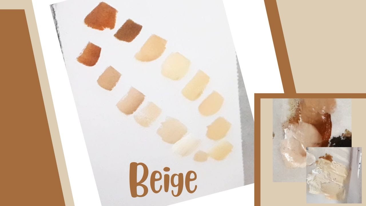
Ratios: There's no magic formula. It's all about visual assessment and incremental adjustments. However, a general starting point could be something like 90% White, 5% Brown, 4% Yellow, and 1% Black (or Red). These ratios are *highly variable* depending on the specific pigments you're using and the desired shade.
Symbols: Visualizing the Mix
While we're not dealing with electrical diagrams here, it's helpful to visualize the mixing process conceptually. Imagine a color wheel:
- Solid Lines: Represent the addition of a pigment to the mixture. The thicker the line, the larger the quantity being added.
- Dotted Lines: Represent the *potential* addition of a pigment, depending on the desired outcome. It's a secondary consideration.
- Color Representation: Each pigment is represented by its corresponding color. White is shown as white, brown as brown, yellow as yellow, and black as black.
- Icons (Optional): If you were using a color-matching software, icons might represent functions like "adjust hue," "adjust saturation," or "adjust value (lightness)." We're doing this manually, so we rely on our visual judgment.
Think of this as a fluid system where you're carefully adjusting the flow of different colors to achieve the right equilibrium.
How It Works: The Mixing Process
The process is iterative and requires patience:
- Start with the Base: Begin with a large quantity of white paint. This is your canvas.
- Introduce the Brown: Add a small amount of brown pigment (Raw Umber or Burnt Umber) to the white paint. Mix thoroughly. Observe the resulting color. It will likely be a light, grayish brown.
- Add the Yellow: Add a small amount of yellow pigment (Yellow Ochre) to the mixture. This will warm up the color and move it towards beige. Mix thoroughly.
- Fine-tune with Black (or Red): If the color is too light or too bright, add a *tiny* amount of black pigment. If the color is too cool or gray, add a *tiny* amount of red pigment. These adjustments should be minimal.
- Iterate and Adjust: Continue adding small amounts of pigment, mixing thoroughly, and comparing the resulting color to your target. Remember, it's easier to darken a light color than to lighten a dark color, so add pigments gradually.
- Check Under Different Lighting: The color will appear different under different lighting conditions (sunlight, fluorescent light, incandescent light). Check your mix under the lighting conditions where it will ultimately be used.
- Consider a Test Panel: Before applying the paint to your project, apply it to a test panel and let it dry completely. The color can change slightly as it dries.
Key Considerations:
- Thorough Mixing: Ensure each pigment is completely mixed into the base paint before adding more. Incomplete mixing will result in streaks and uneven color.
- Small Increments: Add pigments in very small amounts, especially black and red. Over-correction is common.
- Documentation: Keep track of the amounts of each pigment you add. This will help you replicate the color in the future. Use a measuring spoon or syringe for consistent measurements.
Real-World Use: Basic Troubleshooting
Here are some common problems and solutions:
- Too Gray: Add more yellow and/or a touch of red.
- Too Yellow: Add a small amount of brown and/or a touch of black.
- Too Dark: Add more white. Be careful not to add too much, as it can dilute the paint and affect its coverage.
- Too Bright: Add a small amount of black or a darker brown (e.g., Burnt Umber instead of Raw Umber).
- Uneven Color: The paint wasn't mixed thoroughly. Mix again, ensuring all pigments are fully incorporated.
Matching Existing Colors: If you're trying to match an existing color, hold a small sample of the existing color next to your mixed paint under the same lighting conditions. Use a color wheel to identify the hues that need to be adjusted.
Safety: Handling Pigments
While mixing paint isn't inherently dangerous, it's important to take precautions:
- Ventilation: Work in a well-ventilated area to avoid inhaling paint fumes.
- Gloves: Wear gloves to protect your skin from paint and pigments.
- Eye Protection: Wear eye protection to prevent splashes from entering your eyes.
- Dust Mask (Optional): If you're working with dry pigments, wear a dust mask to avoid inhaling fine particles.
- Disposal: Dispose of paint waste properly according to local regulations.
Risky Components: While most automotive paints are relatively safe when handled properly, some may contain volatile organic compounds (VOCs). These compounds can be harmful if inhaled in large quantities. Always read the manufacturer's instructions and safety data sheets (SDS) before using any paint product.
Creating the perfect beige is an art and a science. It requires patience, attention to detail, and a willingness to experiment. By understanding the principles of color theory and pigment interactions, you can achieve a professional-quality finish that perfectly matches your needs.
We have a handy color mixing guide and reference chart as a PDF file that you can download for future use. It includes common color formulas and tips for color matching. This resource is designed to provide a quick reference for your future automotive painting projects.