How To Make A Light Blue Color
Ever found yourself needing to perfectly match that light blue paint on your classic '67 Mustang, or wanting to create a custom, eye-catching color for your next project car? Understanding how to mix the precise shade of light blue is a fundamental skill for any serious car enthusiast, restorer, or modder. This article delves into the technical aspects of color mixing, providing you with the knowledge and techniques to achieve that perfect light blue hue. This isn't just about throwing paint together; it's about understanding the science behind color and how to control it.
The Quest for Cerulean: Deconstructing Light Blue
Our goal here isn't just to get *close* to light blue. We're aiming for accuracy. Light blue, in the world of automotive paint, is a complex mix, and understanding its components is crucial for replicating it consistently. We will explore additive and subtractive color mixing, essential techniques to color creation.
Key Specs and Main Parts: The Color Recipe
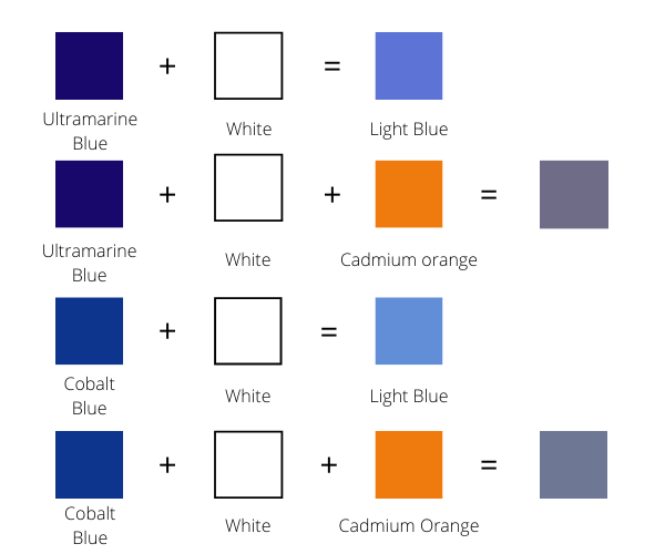
The foundation of any paint mix is the primary colors: red, yellow, and blue. In the context of paint mixing, these are considered subtractive primaries. This is because paint pigments absorb (subtract) certain wavelengths of light and reflect others, creating the color we perceive. Light blue is primarily derived from blue and white, with the possibility of other colors such as green or yellow for color adjustment.
- Blue Pigment: Crucially, the type of blue pigment matters. Phthalo Blue (PB15, PB16) is a strong, vibrant blue with a slight green undertone. Ultramarine Blue (PB29) is a warmer, reddish-blue. The choice will depend on the desired shade of light blue.
- White Pigment: Titanium Dioxide (TiO2) is the most common white pigment, known for its high opacity and brightness. The type of white will impact the overall hue of the light blue.
- Optional – Green Pigment: If the light blue needs a more "aqua" or turquoise lean, a touch of Phthalo Green (PG7) can be added. This should be done incrementally and with extreme caution, as green can quickly overpower the blue.
- Optional – Yellow Pigment: For a warmer shade of light blue, consider adding a small amount of a yellow pigment. Cadmium Yellow Light is generally preferred.
- Binder/Vehicle: This is the liquid component of the paint that carries the pigment. The type of binder (acrylic lacquer, urethane, etc.) depends on the application.
- Thinner/Reducer: Used to adjust the viscosity of the paint for spraying or brushing.
Understanding the Language of Color: Color Theory
Before diving into the mixing process, let's review some essential color theory terms:
- Hue: The pure color, such as blue, red, or yellow.
- Value: The lightness or darkness of a color. Adding white increases the value (makes it lighter), while adding black decreases the value (makes it darker).
- Chroma (Saturation): The intensity or purity of a color. A highly saturated color is vivid and bright, while a desaturated color is duller.
- Undertones: The subtle colors that influence the overall appearance of a hue. For example, some blues have a green undertone, while others have a red undertone.
- Metamerism The phenomenon where colors appear to match under one light source but differ under another.
When mixing paint, it’s very important to understand the relationship between these color properties. Mastering these concepts is key to getting predictable and desired results.
How It Works: The Mixing Process
The process of creating light blue involves carefully controlling the ratio of blue and white pigments. The exact ratio will depend on the desired shade of light blue and the strength of the pigments used. Start with a small amount of blue pigment and gradually add it to a larger amount of white pigment. This is crucial, as it's much easier to darken a color than to lighten it. Consider the following steps:
- Prepare the Base: Begin with a clean container and a generous amount of white paint. This will be your base.
- Introduce Blue: Add a *very* small amount of blue pigment to the white paint. Use a palette knife or mixing stick to thoroughly blend the two.
- Evaluate and Adjust: Carefully assess the resulting color. If it's too dark, add more white. If it's not blue enough, add a tiny bit more blue. Remember: less is more!
- Optional Adjustments: If you want to shift the hue towards green, add a *pinprick* of green pigment. If you want a warmer blue, add a *pinprick* of yellow. Always mix thoroughly after each addition.
- Record Your Ratios: Meticulously document the amounts of each pigment used. This will allow you to replicate the color in the future. Use a small digital scale for precise measurements.
- Test the Color: Apply a small sample of the mixed paint to a test panel or a piece of masking tape. Allow it to dry completely and compare it to your target color. Remember to view the sample under different lighting conditions to account for metamerism.
Real-World Use: Troubleshooting Tips
Even with careful mixing, issues can arise. Here are a few common problems and their solutions:
- Color is too dark: Add more white pigment, a little at a time, until the desired lightness is achieved.
- Color is too saturated (too vibrant): Add a touch of a complementary color (e.g., orange for blue). This will dull the color slightly. Alternatively, adding a small amount of gray pigment can desaturate the color.
- Color is too cool (too green/cyan): Add a tiny amount of red or yellow to warm the blue hue.
- Color is too warm (too red/purple): Add a tiny amount of green to cool the blue hue.
- Paint is too thick: Add the appropriate thinner or reducer, following the manufacturer's instructions.
- Paint is too thin: Allow the paint to sit uncovered for a period of time to allow some of the solvent to evaporate, increasing the viscosity.
Remember that a spray-out card is essential for testing your mixes. Spray a sample of the paint on a card and let it dry completely. Only then can you accurately assess the color and make any necessary adjustments.
Safety First: Handling Automotive Paints
Working with automotive paints involves handling potentially hazardous materials. Always prioritize safety. Here are some crucial precautions:
- Ventilation: Work in a well-ventilated area. Fumes from paint and solvents can be harmful if inhaled. Use a respirator equipped with appropriate filters for organic vapors and particulates.
- Personal Protective Equipment (PPE): Wear gloves (nitrile or neoprene) to protect your skin from contact with paint and solvents. Eye protection (goggles or a face shield) is also essential.
- Flammability: Many automotive paints and solvents are flammable. Keep them away from heat, sparks, and open flames.
- Waste Disposal: Dispose of waste paint and solvents properly. Do not pour them down the drain or into the environment. Check with your local authorities for regulations on hazardous waste disposal.
- Mixing Precautions: Avoid breathing in the dust when handling dry pigments. Use a dust mask when working with these materials.
Always read and follow the manufacturer's safety instructions for all paint products. Failure to do so can result in serious health risks.
Advanced Techniques: Layering and Tinting
For advanced color effects, consider layering different shades of light blue or using tinted clear coats. Layering involves applying multiple thin coats of different colors to create depth and dimension. Tinted clear coats can be used to subtly alter the hue of the base color. These techniques require a high level of skill and experience, so practice on test panels before applying them to your project car.
The Master Colorist: Fine Tuning Your Process
Becoming proficient at color mixing requires practice and a keen eye for detail. The most important thing you can do is to experiment and learn from your mistakes. Keep a detailed record of your mixes, noting the ratios of each pigment and the resulting color. Over time, you will develop an intuitive understanding of how different pigments interact and how to achieve your desired color. This information will not only help with making color adjustments, it will also allow you to re-mix your colors at a later date.
We have a detailed color mixing chart available for download that you can use as a guide. This chart includes various shades of light blue and the approximate pigment ratios needed to achieve them. Download it and keep it in your workshop as a valuable reference tool.