What Color Does Burgundy Go With
Alright, you've got a burgundy ride, and you're looking to customize it, maybe with some new stripes, interior accents, or even just sprucing up the engine bay. Figuring out what colors play well with burgundy, that rich, wine-like hue, is absolutely crucial. We're not just talking aesthetics here; understanding color theory helps prevent clashes, creates a cohesive visual identity, and even enhances the perceived value of your vehicle. Think of it as optimizing your car's visual performance – just like you'd optimize its engine performance. This guide will break down compatible color palettes for burgundy, helping you make informed decisions for your next customization project.
The Burgundy Base: Understanding the Undertones
Burgundy isn't just "red"; it's a complex blend, and understanding its underlying tones is essential for successful color pairing. At its core, burgundy is a dark red with hints of purple and brown. These undertones are what dictate which colors will harmonize and which will clash. We can analyze this using a basic color wheel, considering terms like hue (the pure color), saturation (intensity of the color), and value (lightness or darkness).
Key Specs and Main Color Categories
Let's categorize colors that typically work well with burgundy:
- Neutrals: Grays, blacks, whites, and creams are your safe bets. They provide a grounding base, allowing the burgundy to stand out without overwhelming the eye. Think of a black leather interior with burgundy piping - classic and sophisticated.
- Metallics: Gold, silver, and bronze can add a touch of luxury and visual interest. Gold, in particular, complements the warmth of burgundy beautifully, while silver offers a cooler contrast.
- Complementary Colors: On the color wheel, the color directly opposite red is green. However, a pure, bright green might be too jarring. Instead, consider muted or earthy greens like olive, forest green, or even a teal with green undertones. These provide a balanced contrast without being overwhelming.
- Analogous Colors: These are colors that sit next to each other on the color wheel. For burgundy, this means shades of red, purple, and even some oranges. Using analogous colors creates a harmonious and subtle effect. A deep plum or a muted brick red can work wonders.
- Accents: These are small pops of color used to draw the eye and add personality. Think of pinstripes, badges, or interior stitching. Colors like tan, copper, or even a carefully chosen shade of blue can work as accents.
The Danger Zone: Colors to Avoid
While experimentation is key, some colors are generally problematic when paired with burgundy:
- Bright, saturated yellows: The contrast is often too stark and can look garish.
- Neon colors: These clash with the sophistication of burgundy.
- Certain shades of orange: Unless carefully chosen, orange can make the burgundy look muddy.
Symbols and Color Representation
When dealing with color palettes, you might encounter different representation methods. Here are a few:
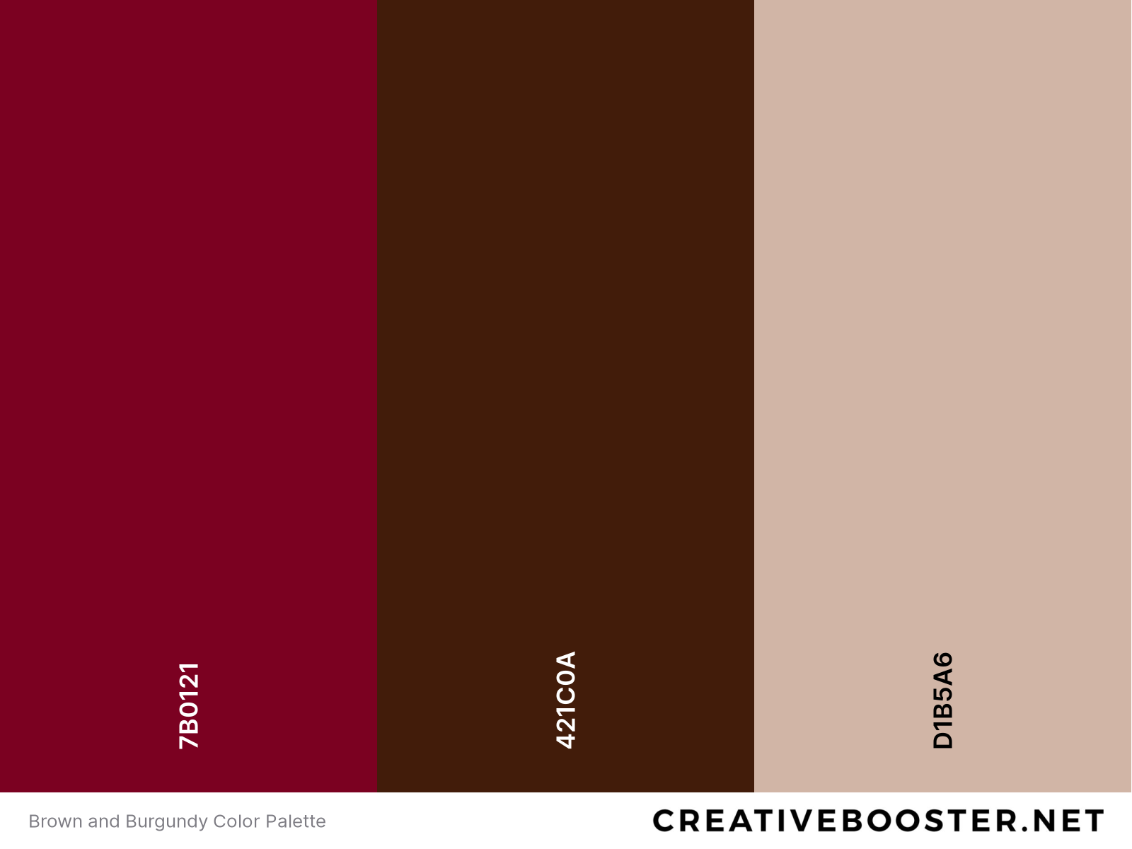
- Hex Codes: These are six-digit alphanumeric codes representing a specific color (e.g., #800020 for burgundy).
- RGB Values: These represent the amount of red, green, and blue light needed to create a specific color (e.g., RGB(128, 0, 32) for burgundy).
- CMYK Values: These represent the amount of cyan, magenta, yellow, and black ink needed to print a specific color.
- Color Swatches: Physical samples of colors, often used for matching paint or fabric.
When working with digital tools for visualizing color schemes, understanding these codes is crucial for accurate color representation. If you are repainting a part of your car and you already have the color code of the burgundy you want, this is essential!
How It Works: Building a Color Palette
Creating a successful color palette is an iterative process. Start with your base – the burgundy exterior. Then, consider the following:
- Define the desired aesthetic: Are you going for a classic, sporty, luxurious, or aggressive look? This will guide your color choices.
- Choose a primary color: This will be the dominant color alongside burgundy. Neutrals are often a good choice for this.
- Select secondary colors: These will be used for accents and details. Consider complementary or analogous colors.
- Visualize the palette: Use digital tools or create physical mockups to see how the colors work together.
- Test the palette: Apply the colors to a small area of your car to see how they look in different lighting conditions.
Remember the 60-30-10 Rule for color balancing. In a well-balanced color palette, 60% of the space is dedicated to the dominant color, 30% to a secondary color, and 10% to an accent color.
Real-World Use: Troubleshooting Your Color Scheme
Even with careful planning, color schemes can sometimes fall flat in reality. Here are some troubleshooting tips:
- The color looks different in sunlight: Natural light can significantly alter the appearance of colors. Always test your palette in different lighting conditions.
- The contrast is too harsh: Try using a softer shade of the secondary color or adding a neutral color to break up the contrast.
- The color scheme feels unbalanced: Adjust the proportions of each color to achieve a better balance. Refer back to the 60-30-10 rule.
- The colors clash: Re-evaluate your color choices and consider switching to a more harmonious palette. Consult the color wheel for guidance.
- Consider the existing car trim: If your car has chrome trim, for example, consider how the colors interact with it. Chrome tends to work well with cooler color schemes.
Safety: When Color Changes Affect Visibility
While this guide focuses on aesthetics, it's crucial to consider safety. Avoid using very dark colors that may make your car difficult to see at night. Also, if you're modifying your lights (e.g., adding colored headlight lenses), ensure they comply with local regulations. Improper lighting can be a serious safety hazard and can result in fines or vehicle impoundment.
Furthermore, remember to wear appropriate personal protective equipment (PPE), such as gloves and eye protection, when working with paints, coatings, and solvents. These materials can be harmful if inhaled or come into contact with your skin.
Important Note: If you are doing any kind of painting yourself, ventilation is extremely important. Vapors can build up and be very dangerous. Use a proper respirator!
We've covered a lot of ground here. Picking colors is tough. We have a detailed color compatibility diagram available for download. It visually illustrates which colors are most likely to work well with burgundy, based on the principles discussed. This diagram includes hex codes, RGB values, and examples of real-world applications. It is available for you, as this will make your project even easier.